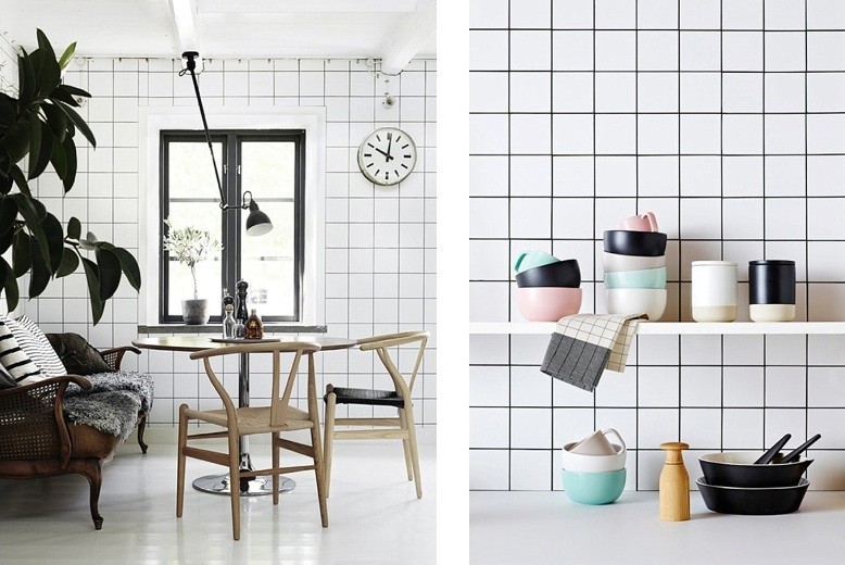
It can be a little bit frustrating, when talking about choosing the tile of a kitchen or a bath renovation. Blaming the market of not having great options is not as wise as admitting that we can not afford the great ones, not mention they have to be basic rectangular, square or round white tiles. Boring? Maybe. But they don't have to be.
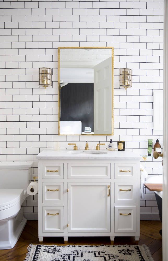
Firstly let me put this: I'm a big fun of a plain white subway tile. It's classic and will always fit for any space. However, there's nothing wrong when you're after something more decorative. So take your inspiration into consideration, here are 10 spaces that use basic tiles in a whole new way:
Above from Est magazine, square and rectangular tiles are placed in a conventional brick-style half-offset pattern, yet they're used in crossing rows, forming a stripped-pattern vision.
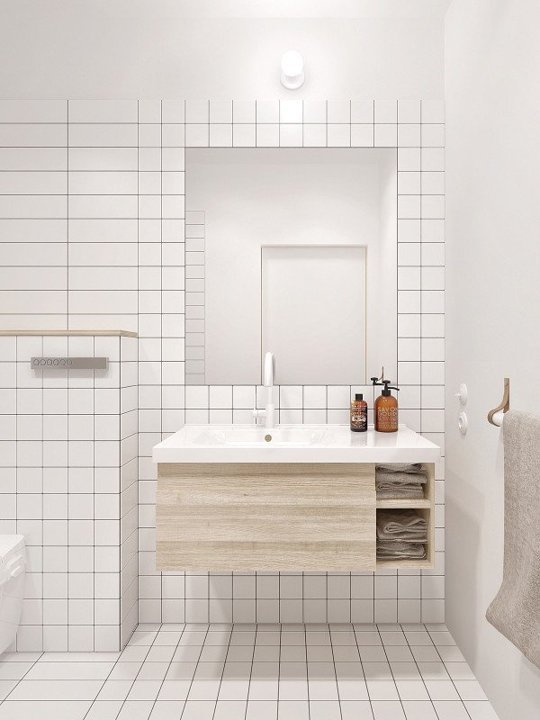
Squares and rectangles are merged together here in this flat from Home Designing, but this time the two shapes share the same height and a more rigid grid pattern is made possible.
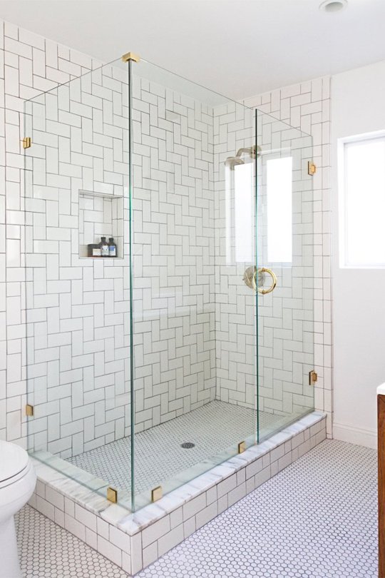
Herringbone pattern for the bathroom is getting popular and popular, here's one from designer Dayka Robinson, but the embedded shelf is so fascinating with penny tiles and high-contrast black grout.
Here at INAMATT’s home studio you can see more mixed tiles. It's hard to see all the details–the kitchen island here blends, from the very bottom to top, there're three rows of large square tiles, perpendicular laid a row of subway tiles, a row of small square tiles and finally a layer of penny rounds (with gray borders at the top and bottom).
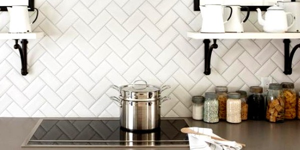
Style of tiles can be promoted with a thick, bold, high-contrast grout, which really brings out the pattern, as seen here in a kitchen from Simo Design.
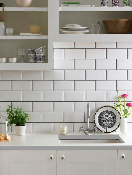
Although earthy and neutral shade is never a wrong choice, colored grout is also a decent choice. Like this bold blue grout for a kitchen island, from The Design Shepard.
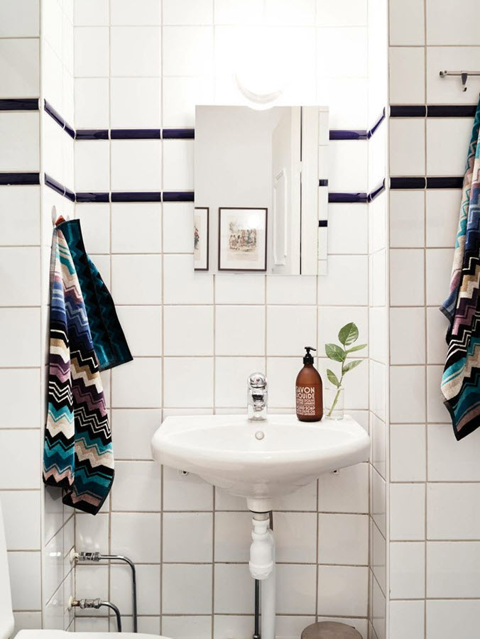
Here's an absolutely unusual tile pattern: Crosshatch. With two this way, two that way, so glad to find it so easy with standard subway tile, like is shown in Elsie's bathroom from A Beautiful Mess.
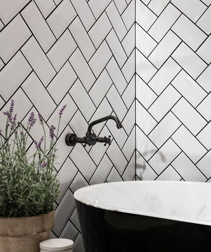
Another simple idea that's full of joy: Just keep the rough edge of your herringbone tile pattern so it leaves a zig-zag border, as seen here in a bathroom from Kate la Vie.
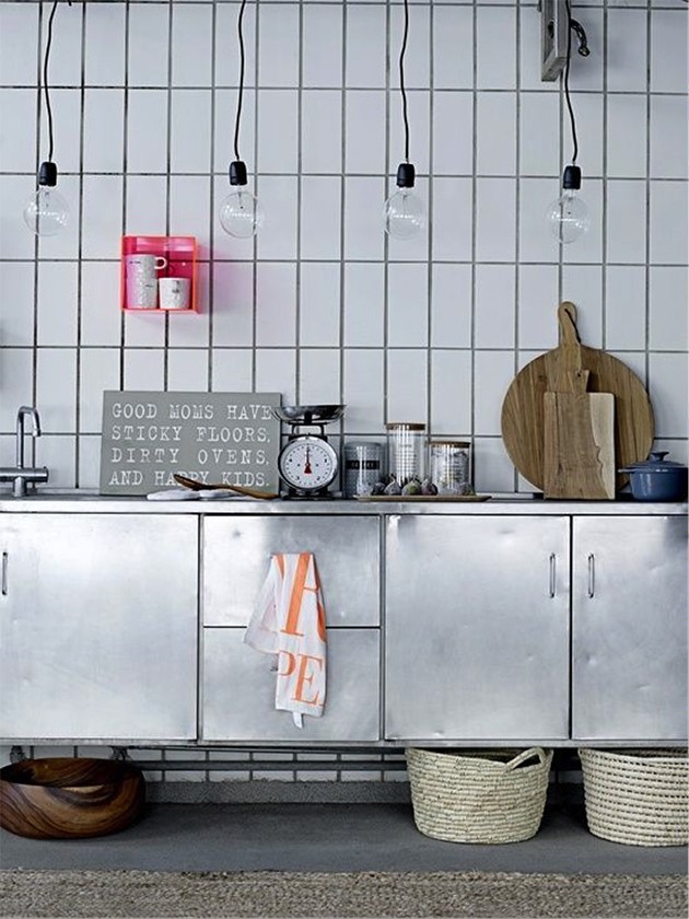
Tile patterns can be switched up to formulate more interesting visual effect. Like is shown on Simo Design, this border of vertical tiles below the cabinets in a subway-tiled kitchen.
Or furnish tiles that are of different-shaped borders or different laid at the top or bottom of a room to mimic the look of molding and baseboards, like here in this bathroom from Dave Fox.






Post Comments
You must be logged in to post a comment.
click here to log in